HOW TO CREATE RESPONSIVE NAVIGATION BAR ?
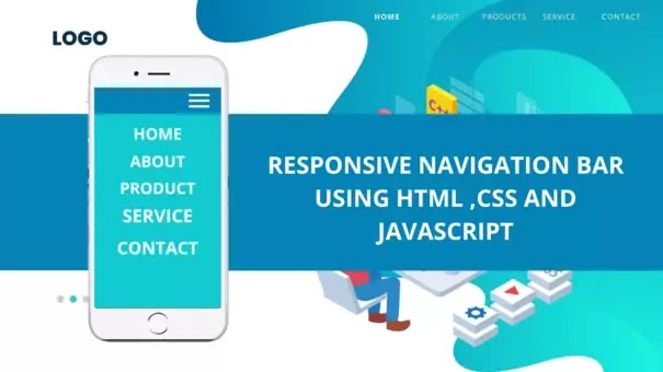
As a web developer, we want to create responsive websites so that they look good on all devices. While creating a responsive website, first we need to create a top navigation bar that fits all devices. So, I am going to discuss how to create a responsive navigation bar that turns into a hamburger menu button on small-sized devices.
Check the link to understand how it works 👉 Responsive navigation bar
You might be wondering how to do it or which properties to use. so, I am going to guide you step by step in completing this job. Though we can do it using the Bootstrap framework, in this article, I am going to show it using HTML, CSS, and a little bit Javascript. Before I start to explain the code, take a look at the code given below.
First, check the HTML code. I am not telling about the basic things like Html, head, meta tag, etc. I just want you to get familiar with new ideas. You can find a link just below the link of the stylesheet. I have added the link for using a hamburger menu icon. The next link I have used for getting a new font-family for styling the logo using google font.
Let's discuss the body section. I am using <a> tag because you can add links of different sections of your web page so that on clicking the links you can reach the section directly. If you notice carefully, you can find that the orders of the link are different in the code and the web page. I have used the opposite order in the code because I am using float property to align the links in the same line with the logo and this causes the change of the order of the links. I think that till now all these things are clear to you. Now, you just imagine that you are using the website in a smartphone and it is showing a hamburger menu at the right. So, you want the hamburger menu to slide out a section containing the links from the edge of the screen when pressed. It will look good right. Now, to show the section, you must add a section in your code that contains the links. For this reason, I have added the <div> having an id "my side panel" and added the same links there. Now you have to add some lines of Javascript so that the menu works on pressing. I have just added two functions that make the sliding section visible and hidden whatever needed. Before you write the Javascript, be sure to add the functions to the particular element so that the Javascript works.
You can just create the basic structure of the navbar from whatever you learned till now. To make the navbar beautiful and responsive, you have to apply some styles. So, let's discuss the CSS code. Here as well, I am discussing some CSS properties you must use. Though I have already mentioned in the CSS code why I have used those properties, I am attaching some links so that you can come to know about those properties in more detail. You should have knowledge of float, position , transition and Media queries to understand why I have used the properties. I think now you can create a responsive navigation bar easily.
I want to advise you don't just copy the code, understand all the ideas thoroughly. If you want to get more articles like this to get a solution to your problems,subscribe to this blog and comment on what you want the next article to be.
Happy coding 😀.


No comments:
Post a Comment